5B: Pioneering the clean tech landscape
5B was founded in 2013 by friends Chris McGrath and Eden Tehan with the goal of transforming the solar industry and promoting the adoption of clean technology globally. They developed a game-changing hinge design that revolutionised solar deployment and led to the creation of their first successful product, 5B Maverick.
The company has experienced rapid growth and works collaboratively with partners in its expanding ecosystem to manufacture and deploy its solutions worldwide. 5B's unique business model and success have prompted an update to its brand identity to reflect its maturity and position as global leaders in cleantech innovation.
Deep Dive
To start the project, we conducted a comprehensive analysis and overview of the current 5B organisation and brand, as well as the industry in which it operates. This step enabled a deep understanding of the different perspectives across multiple business vantage points and expanded the awareness to identify opportunities for growth. Through this process, new ideas were sparked and potential opportunities were recognised.
"WordPlay developed a visual identity which really reflects our evolution from pioneers of a single amazing 5B Maverick product to global leaders in solar innovation."
Bernadette Jolley,
5B Head of Marketing
Brand Strategy
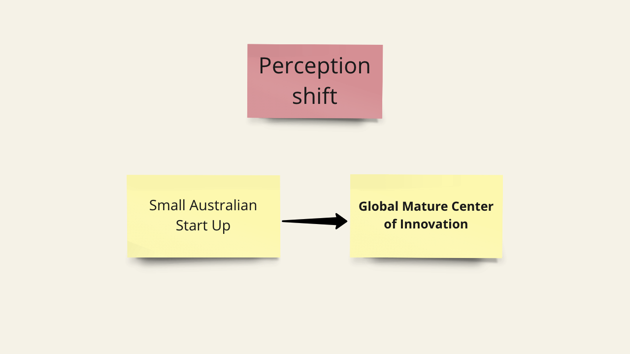
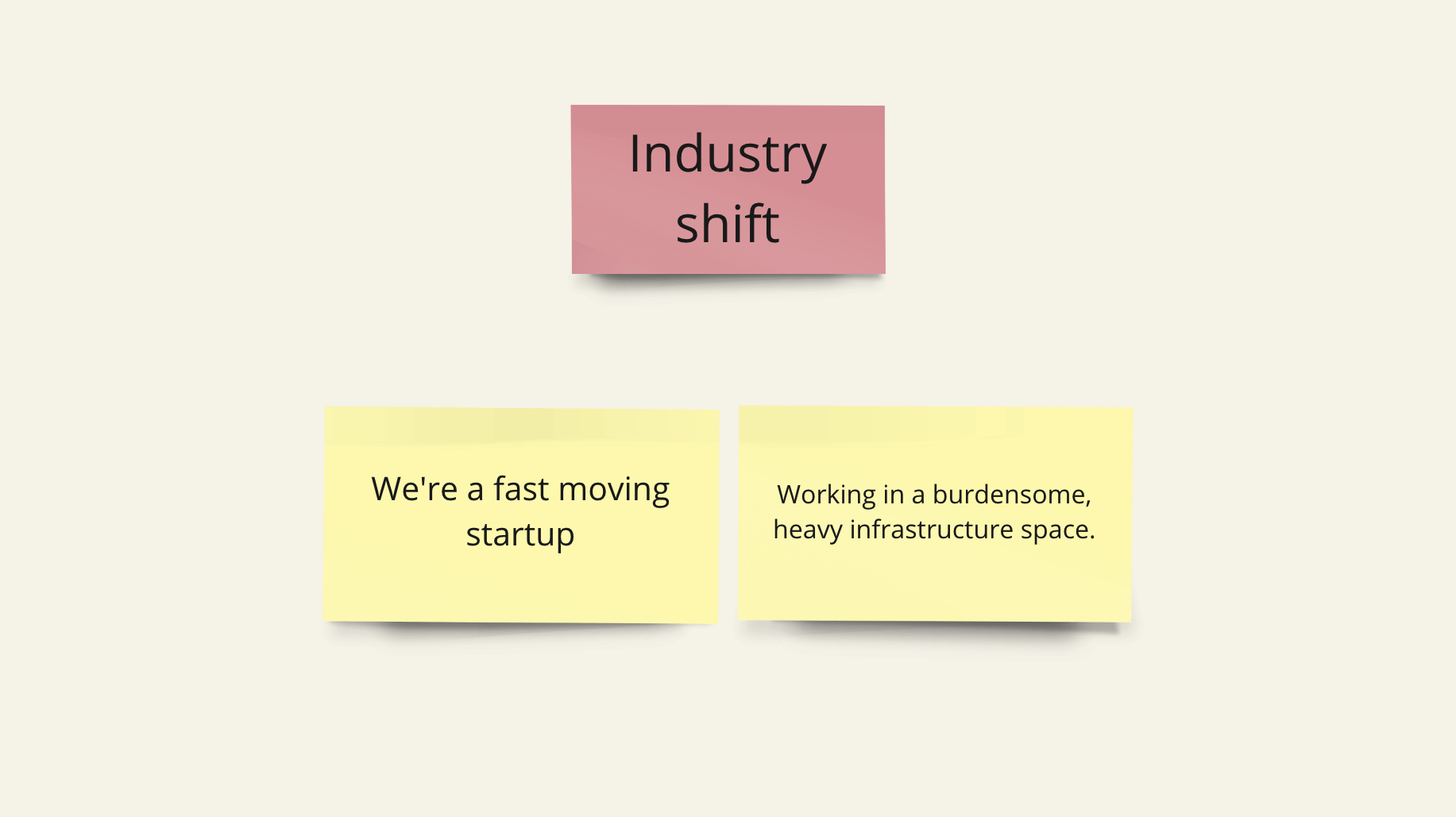
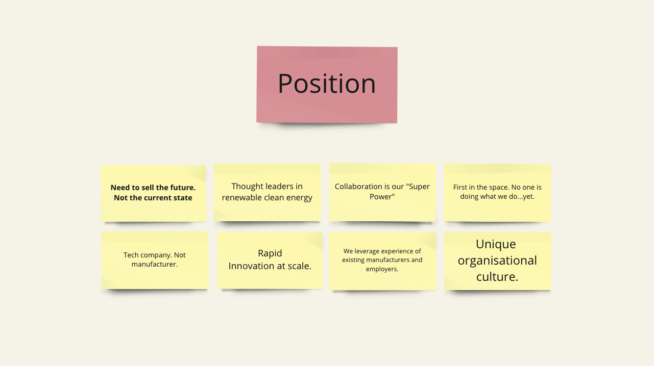
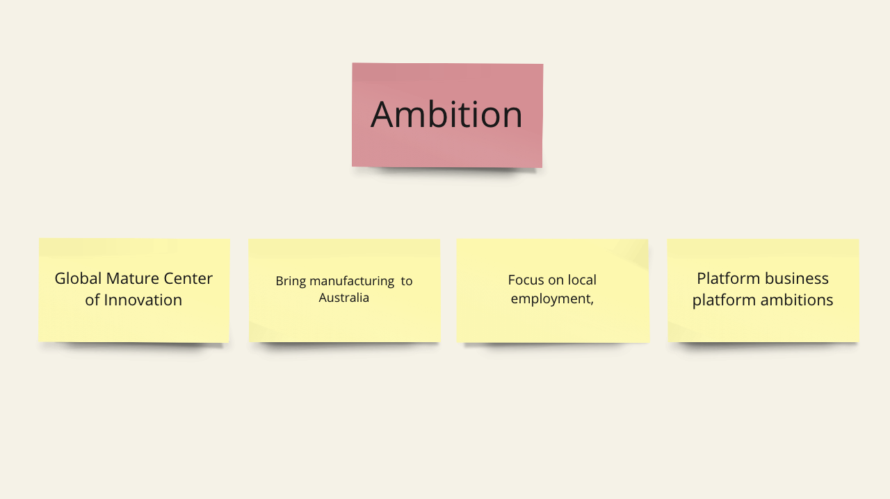
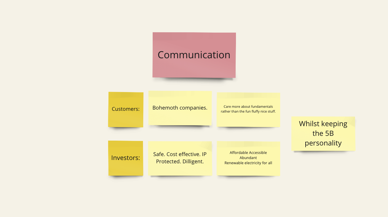
The deep dive revealed several challenges for 5B, including selling the potential for future growth rather than the current state, shifting perception from a small Australian start-up to a global centre of innovation — repositioning the company as a leader in clean tech innovation rather than solar deployment.
To address these challenges, the key opportunities for growth included repositioning 5B, streamlining business processes and communication, developing a unique brand identity that emphasises their unique value proposition, and storytelling.


The kind of company Australia can build.
In designing the visual identity system it was important to maintain the founding culture and origins of 5B while scaling this ethos to a new level of the organisation’s maturity.
In the case of 5B, building recognition as the leading innovator in clean energy tech, we created a visual identity system that enabled this representation while affirming the founding culture.
To achieve this, a comprehensive and holistic design system and toolkit was created, accommodating all business requirements and potential opportunities for growth and expansion.

Introducing a symbol
To establish 5B as the masterbrand a symbol was introduced to enable the creation of a broader sub-brand system.
The inspiration behind the name 5B stems from scientists' predictions that in 5 billion years, the Sun will expand and make the Earth uninhabitable. The name also serves as a reminder that we need to revolutionise our energy systems on a large scale to avoid making the Earth uninhabitable for humans sooner than predicted.
Balance of tech and nature
The concept for the symbol was to represent the relationship between Earth's orbit around the Sun, which could be easily drawn in the iconic red sand of the Australian outback where 5B deploys its technology. Additionally, the logo had to be versatile enough to be applied to a wide range of machinery, signage, and brand collateral.


Sub-brand system
To clearly distinguish 5B MAV as a product of 5B, we introduced a sub-brand lockup system that includes 5B MAV's unique logo and sub branding. This system ensures that 5B MAV appears visually distinct from 5B and structures 5B as the masterbrand. This enables the innovation of new products like 5B MAV while maintaining a cohesive brand identity across all 5B’s offerings.


A new language
In creating a distinct visual language for 5B, we struck a balance between cutting-edge technology and its connection to the natural world. Our inspiration came from the stunning landscapes of the Australian Desert, which influenced the colour choices.
We refreshed the colour palette to include earthy creams, warm greys, and an extended range of vivid minerals and metallics, while retaining 5B's recognisable orange as the primary colour, encapsulating the Earth and Sun. The font, Prompt, creates a sleek and modern reading experience, marrying the elements of engineering and efficiency with the natural colours and new 5B logo.


Thanks to all those involved in the collaboration process.
5B project team: Bernadette Jolley, Kayle Everett, Sam Whelan & Ayla Dhyani.
WordPlay Studio: Rix Lee, Tom Horne & Ethan Wilmen