TidyMe
Branding Australia’s top rated and most loved home cleaners.
Context
TidyMe, founded by Stacey Jacobs in 2014, is a platform providing a valuable, long term connection for homeowners, workplaces and their cleaners. The platform offers cleaners flexible access to work based on availability and location. TidyMe is also the highest rated cleaning service in Australia providing quality service to both customers and their growing network of cleaners. TidyMe was ready to scale and take ownership of the rapidly expanding on demand cleaning market.
Design Disciplines
Brand audit
Purpose design
Brand strategy
Brand identity system
User experience design
User interface design
The Process
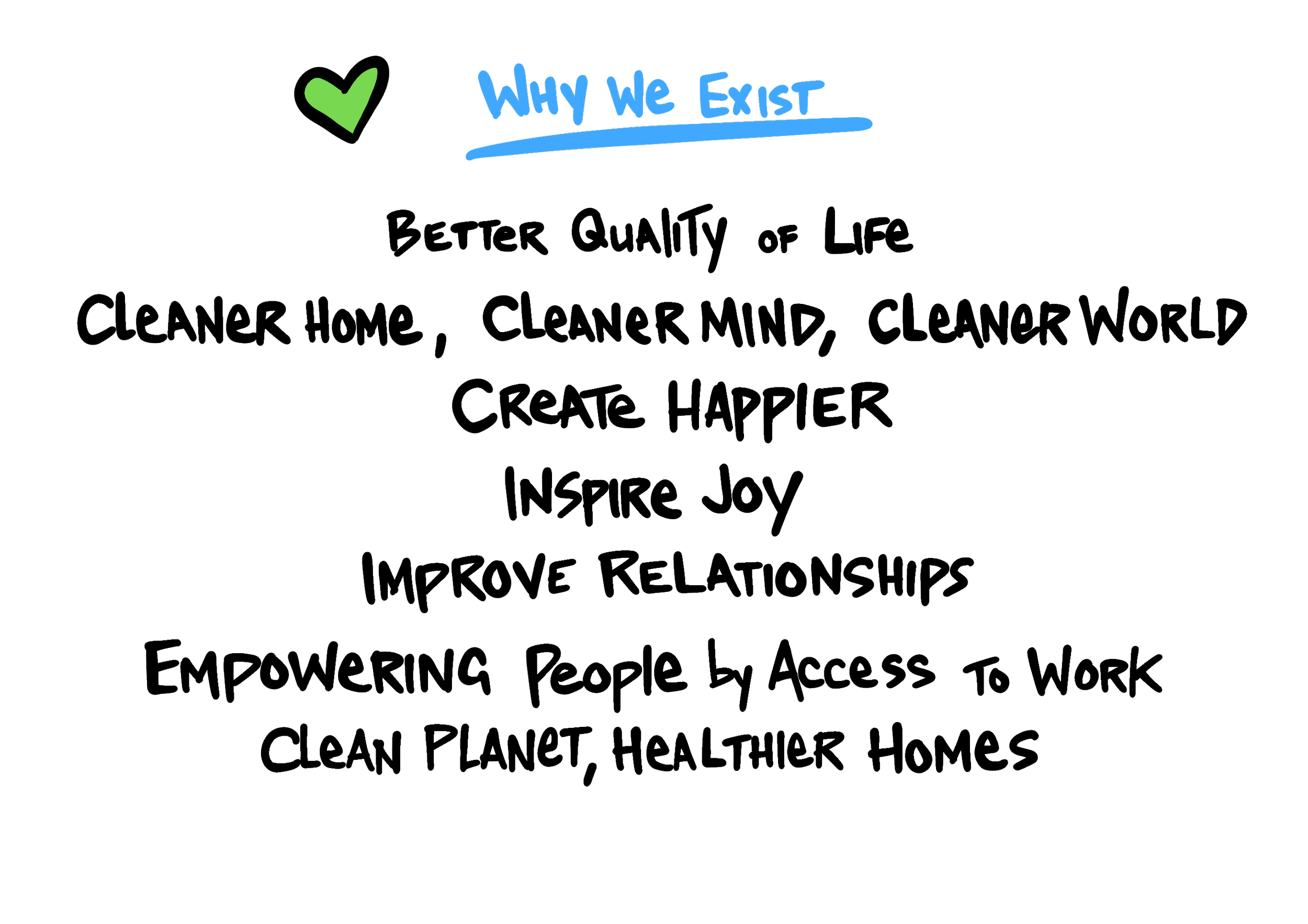
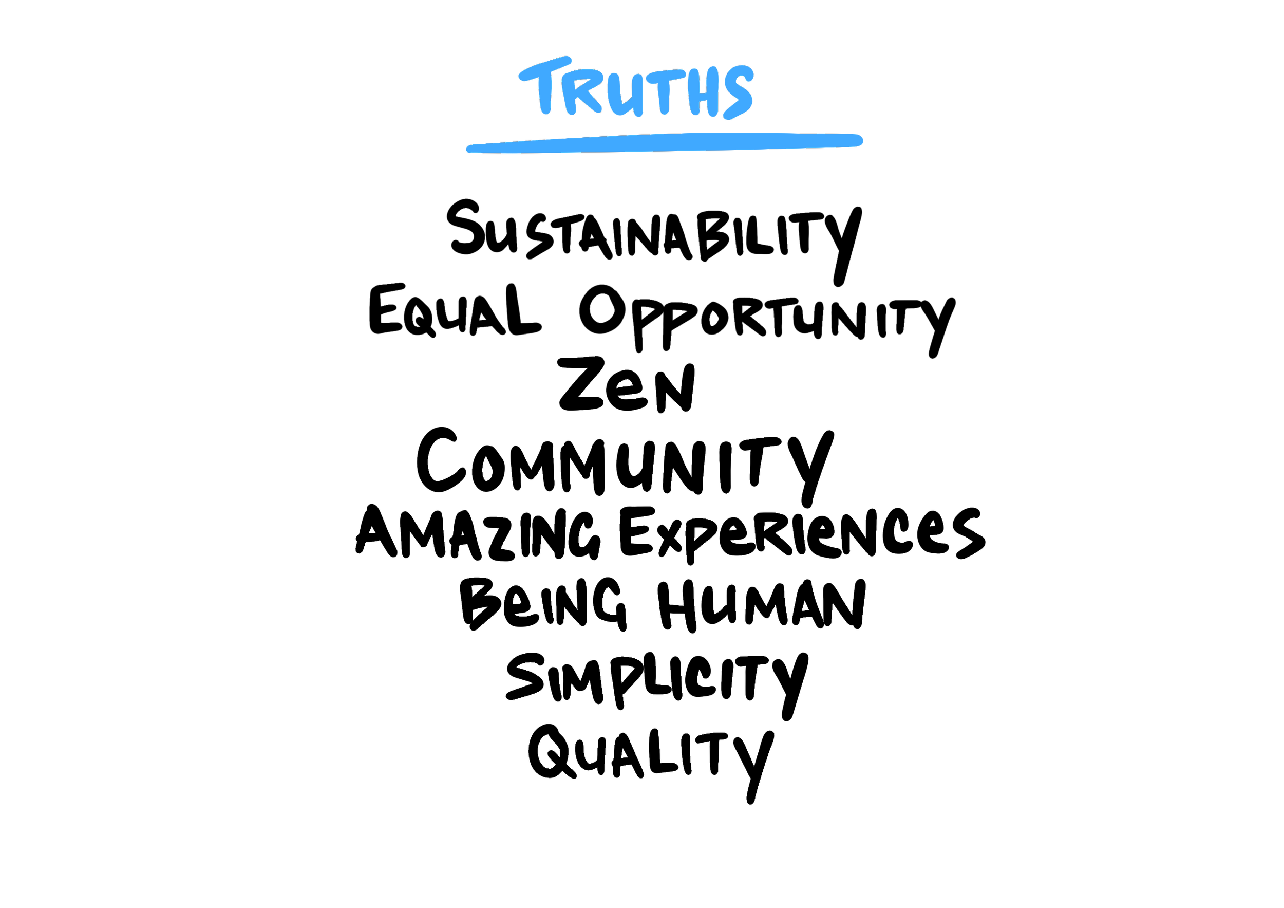
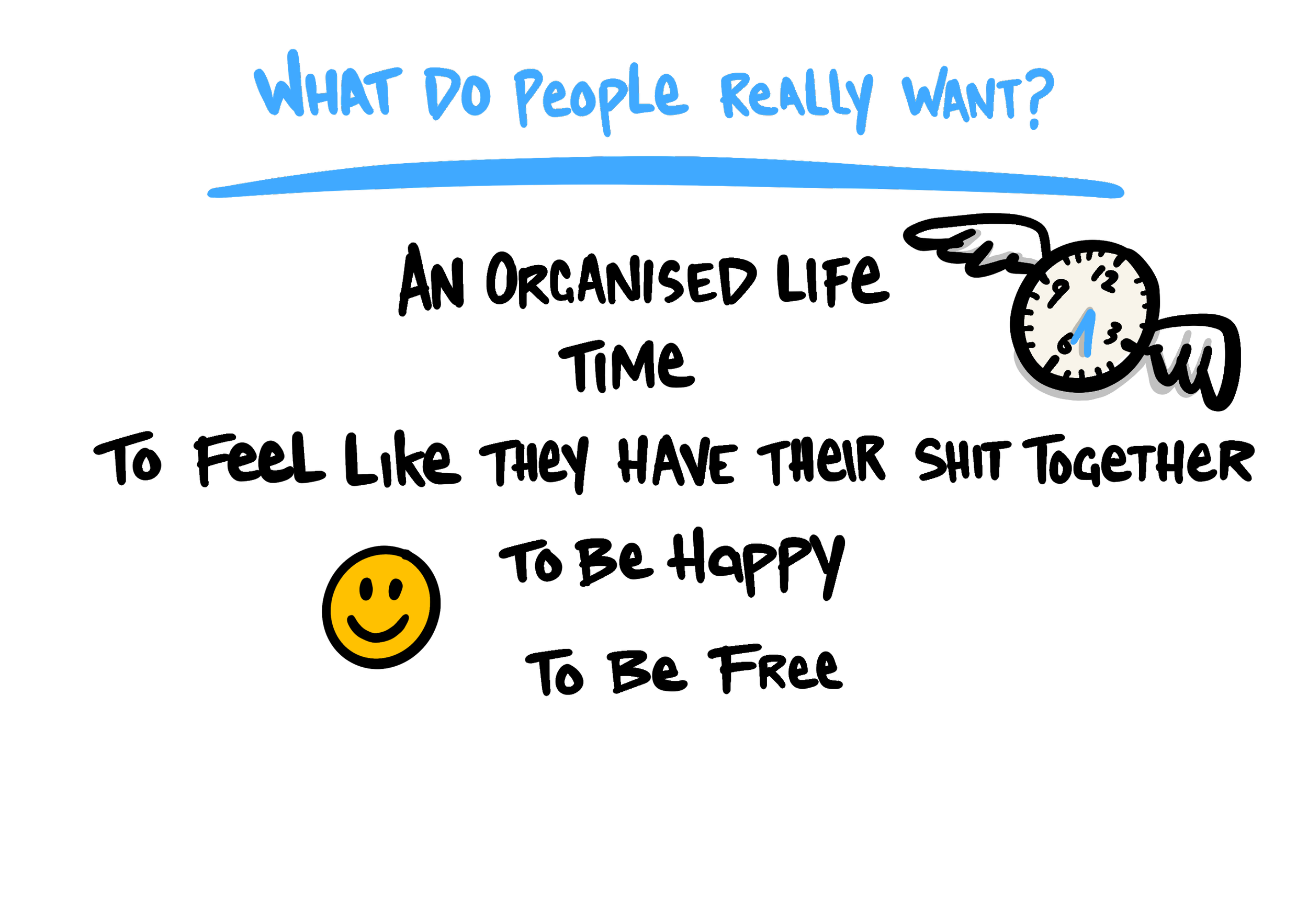
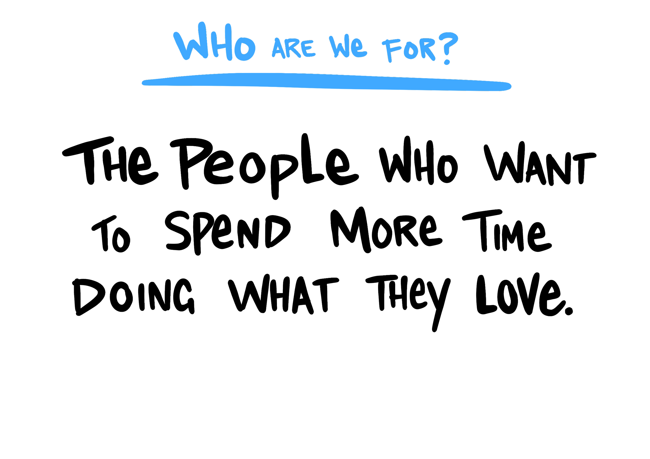
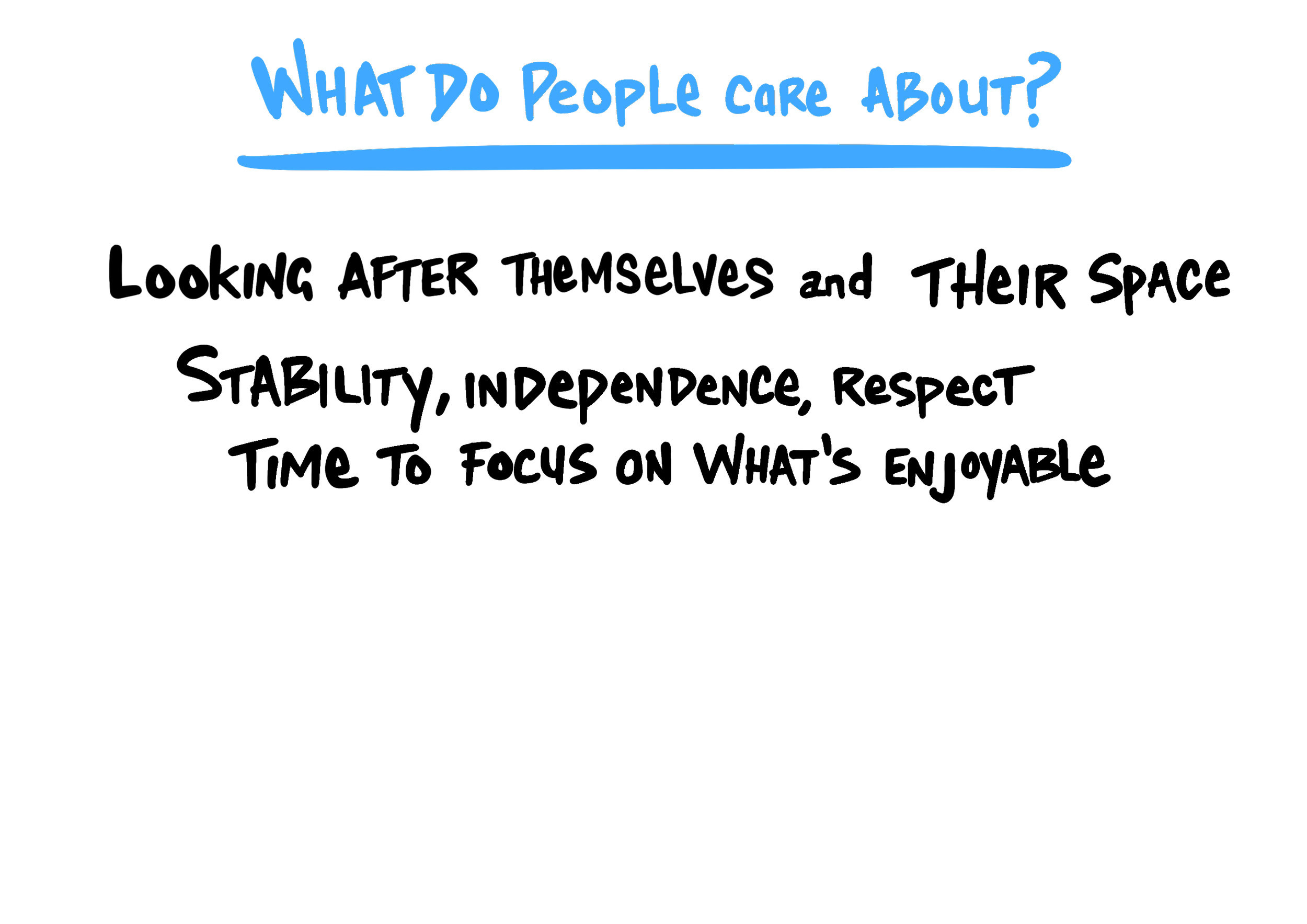
After conducting an extensive brand audit of TidyMe we facilitated a design session with Stacey and her Ops Manager Sophie Bosch to map out the difference of the organisation. The key insight that was uncovered through this process was that at the core of TidyMe, it’s really about people having more time to spend doing what they love.
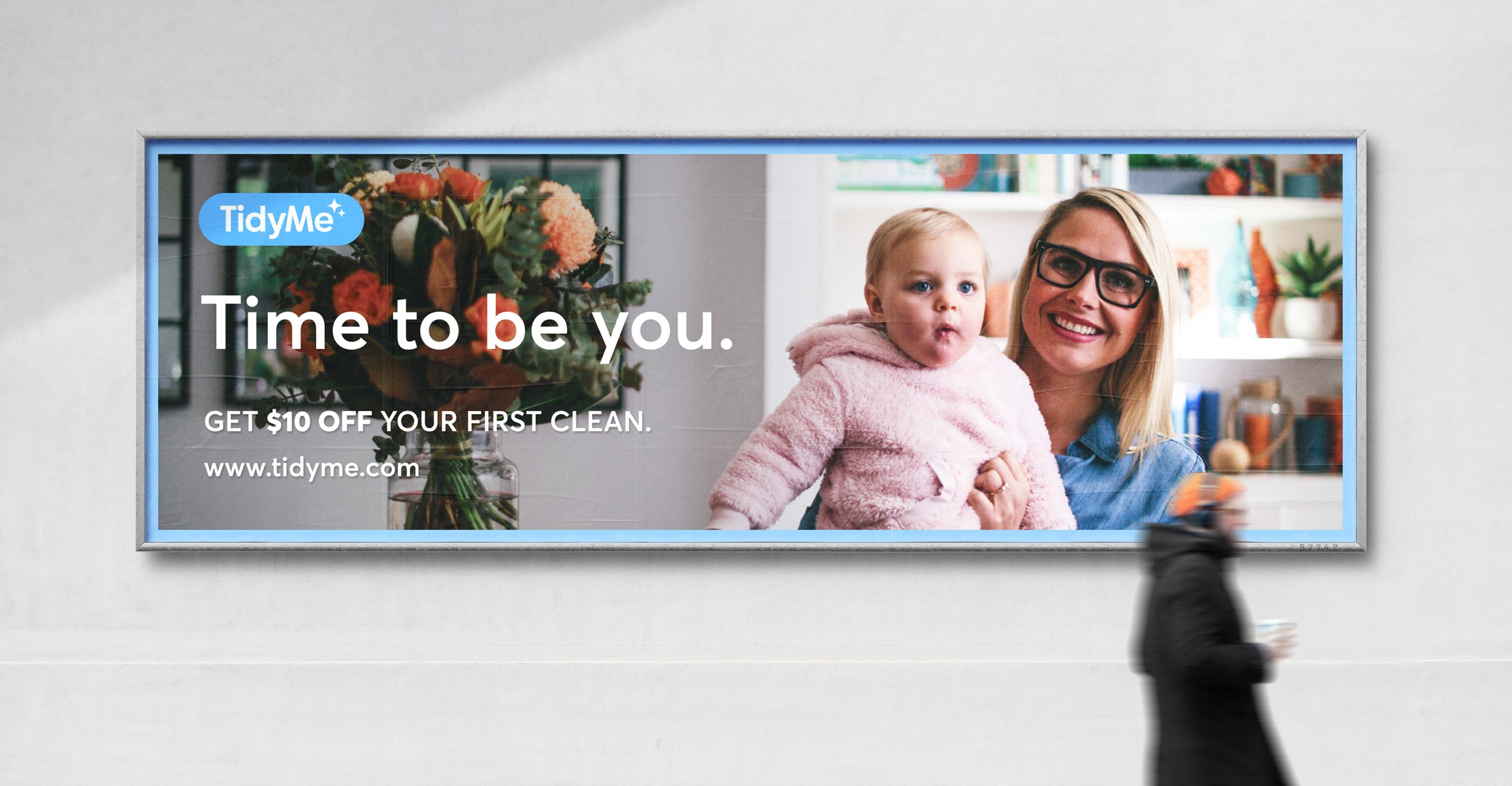
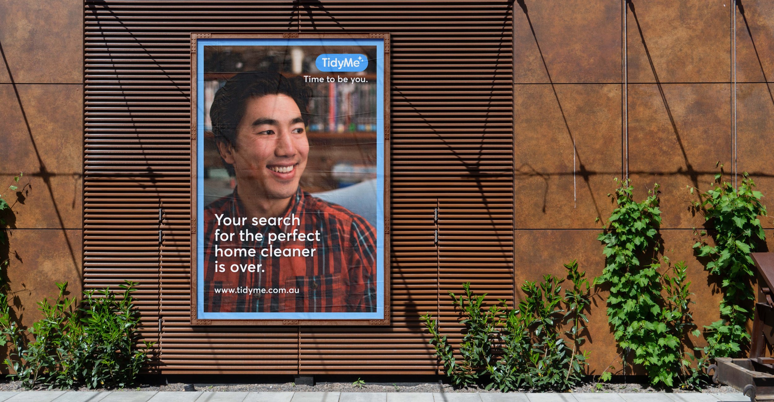
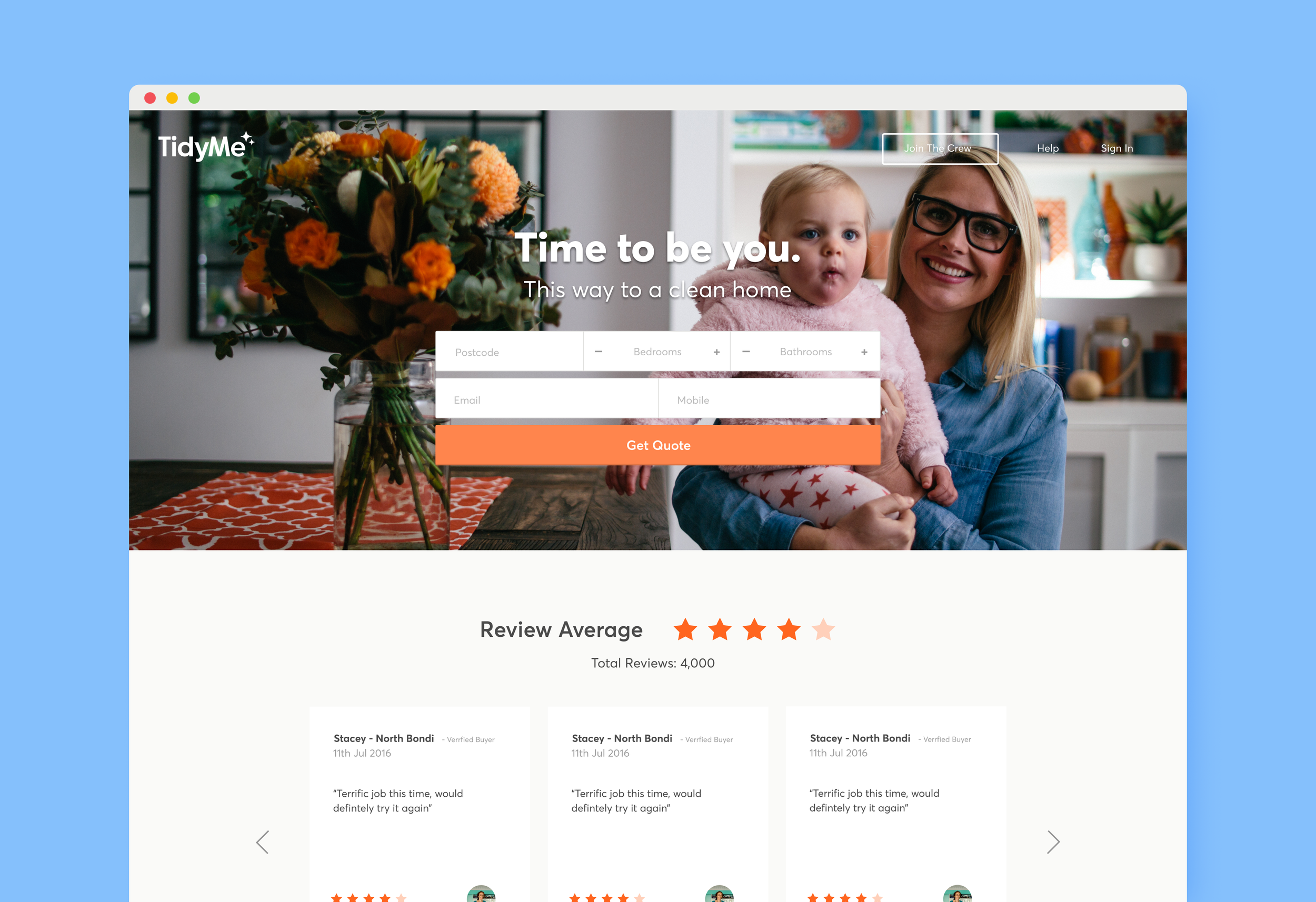
This was distilled down into TidyMe’s new tagline ‘Time to be you’ which became the foundation for the evolved TidyMe brand identity system.

Discoveries
To create a company culture within the immediate TidyMe team and an extended family culture amongst the cleaning crew
Increase trust perception through TidyMe, “We have done the scouting for you!”
Story telling of cleaners and customers doing things they love with their extra free time
Delivering wow through service
Designing an onboarding process for both cleaners and customers
Shifting the stigma attached to being a cleaner
A sparkly clean identity
It’s always important to us that the identity we design fits the organisation, it’s people and it’s culture. We pay attention to details such as the clothing, the style, the artefacts, environment and the vibe as input in our design process. In exploring directions for the TidyMe brand a big influence came from the 1950’s era of cleaning products and classic TV shows such as Bewitched as it was the perfect cross section of magic, nostalgia, quirkiness and warmth.

Tidying up the TidyMe brand
Our evolution of the TidyMe logo mark was a tidy up of the original logo type. Our intention was to maintain TidyMe’s brand recognition while giving it a fresh clean feel. We added the double sparkle on the end of the logo as a graphic device that could also be used as a stand alone logo mark.
The double sparkle represents of the relationship between the cleaner and the customer and how they enable each other to each have more time to be themselves and do more of what what makes them happy.

“We believe that our new look, brought to life by WordPlay Studio, truly reflects the people centric company culture that has been at the core of our business since we began in 2014.”
Stacey Jacobs, Founder TidyMe
Shifting perceptions
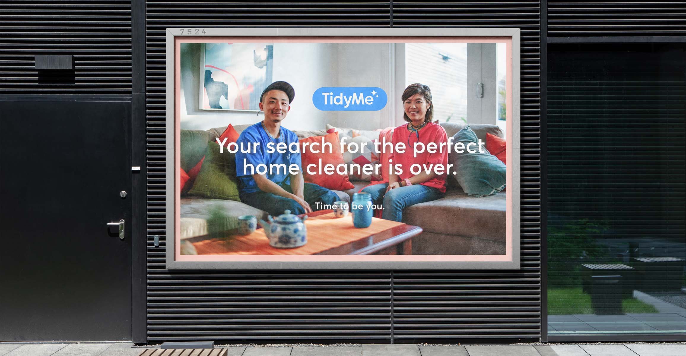
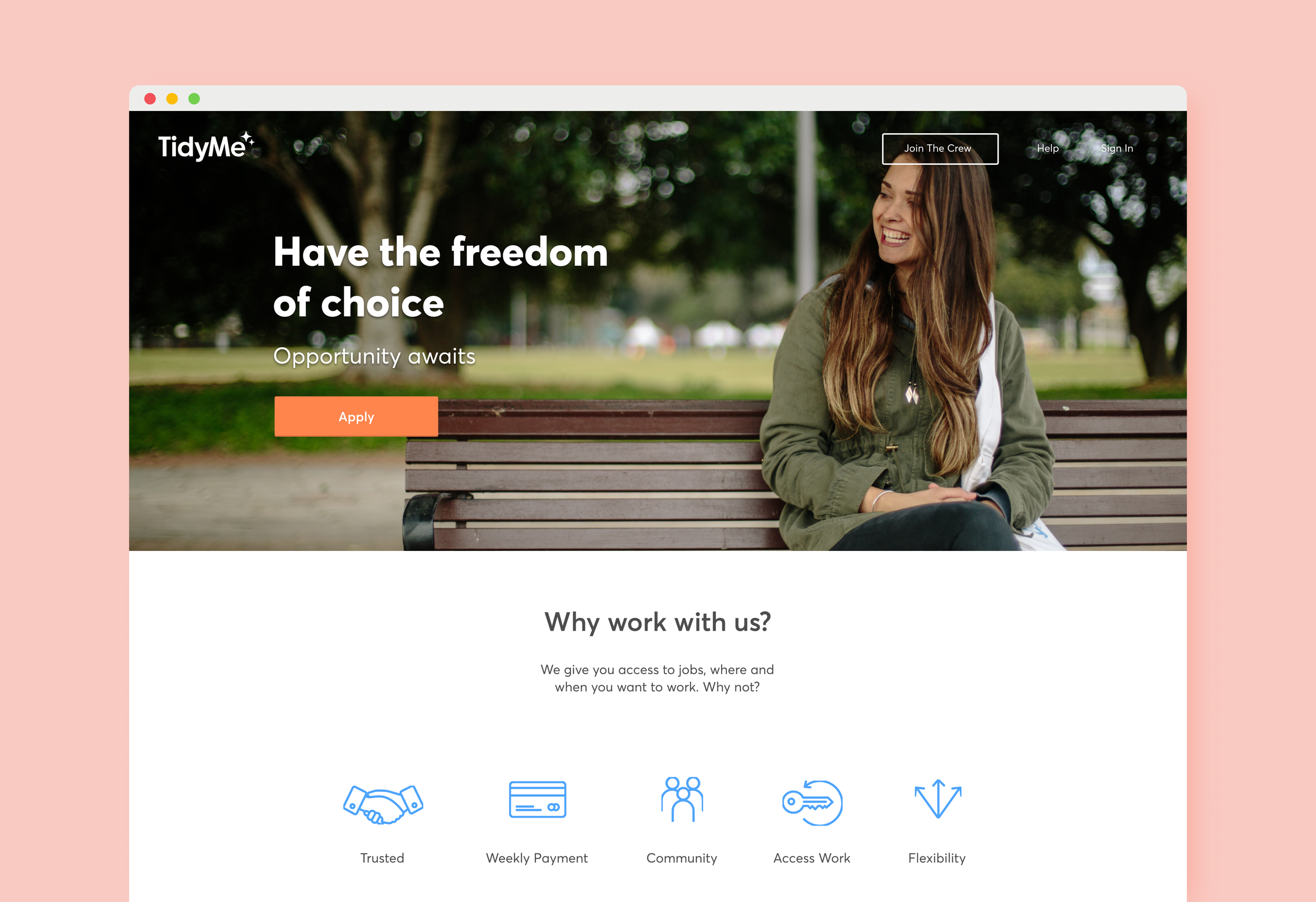
Through our design process it was uncovered that there were some key perceptions that needed to be shifted. In order to shift these perceptions we created imagery that made it hard to distinguish the difference between who was a customer and who was a cleaner.
The result was storytelling around the things people could do in their extra free time enabled by the platform. We collaborated with Film Director and Cinematographer Kate Halpin to create a brand video and still photography for use in online advertising and the TidyMe digital applications.


Digital experience
We designed the digital touch points for TidyMe considering both the user experience and look and feel for both customer and crew. With ambitions of being the ‘Uber of cleaning’ it was essential that we conducted a thorough UX process starting with designing the complete user journey for both.
Once we had a solid framework through wire framing and testing the designs in low fidelity we could then apply visual design.

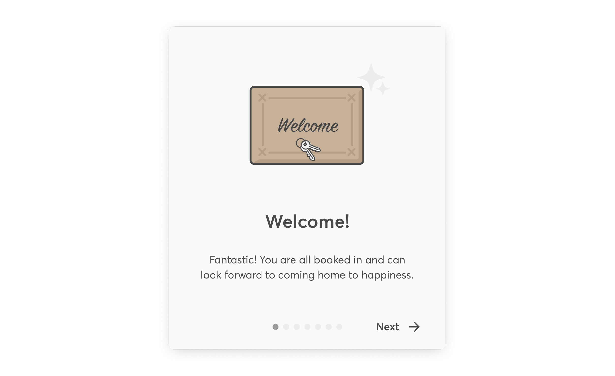
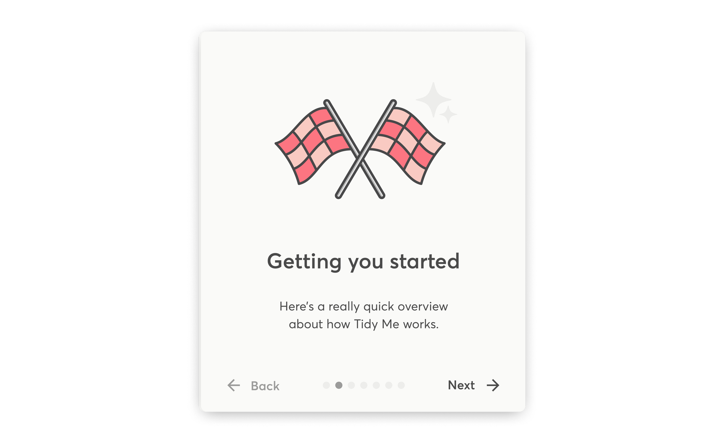
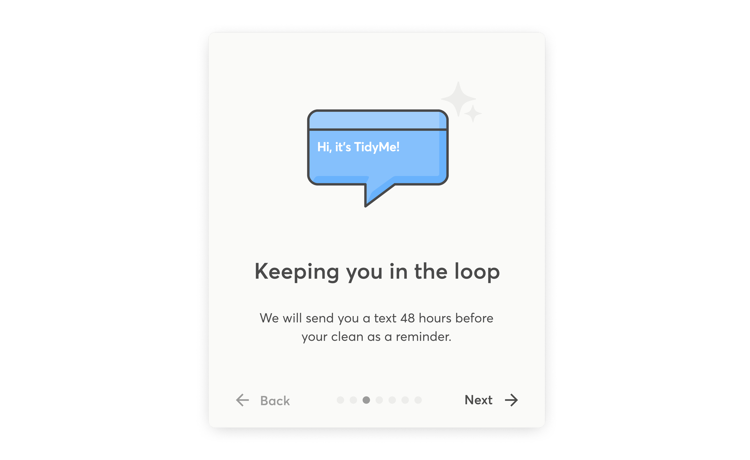
Onboarding and improved efficiency
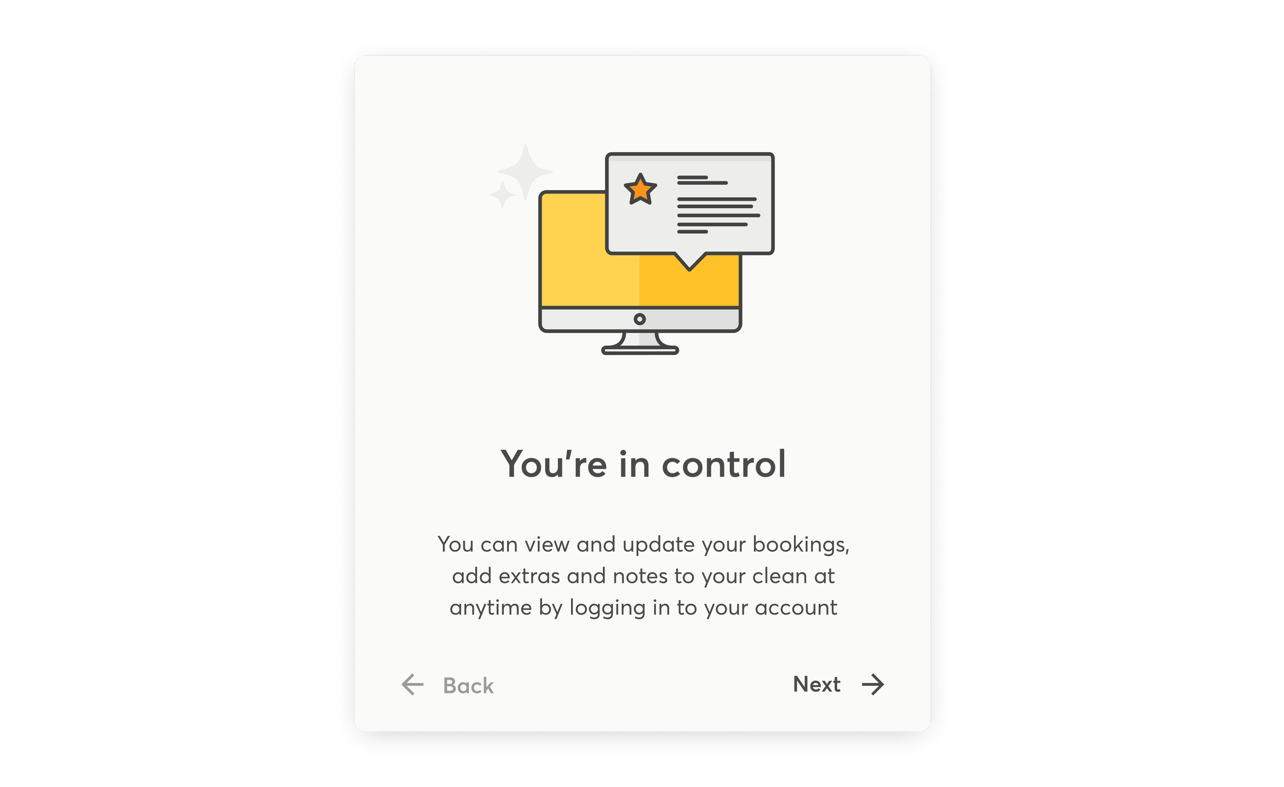
One of the key business challenges we overcame on this project was around time spent manually onboarding customer and crew. We solved this problem through the design of the user journey, communications and designing a smooth onboarding process.
By solving this problem not only did we design a beautiful user experience, but we also improved business efficiency, gifting more time and more zen to the TidyMe team.


Outcome
TidyMe went on to raise subsequent investment from Adcock PE and private investors as the business grew and scaled nationally. By late 2018, TidyMe reached profitability and was generating $3.5M ARR, operating in 489 postcodes and had completed over 90K jobs.
In 2018, TidyMe was acquired by OneFlare, as part of a shift in strategy with the aim to become the on-demand marketplace for Australians to book a variety of service providers.

Billy tucker, OneFlare & Stacey Jacobs, TidyMe
“TidyMe has built a standout brand that’s well known for quality, which is reflected in impressive consumer ratings. Their focus on excellence is incredible and you can see that through the number of customers subscribed to a week in week out cleaning service.”
Billy Tucker, OneFlare CEO
Project team
WordPlay Studio
Rix Lee, Tom Horne & Luke Anderson
TidyMe
Stacey Jacobs & Sophie Bosch
Collaborators
Kate Halpin
Video Production